Notes on ergonomic colour adjustmen
t
Notes on ergonomic colour adju
stment
If you select colours for the monitor in your application programmes,
take note of the information below.
The primary colours blue and red on a dark background d o not produce the minimum
required con trast of 3:1 and are therefore not suitable for continuous text and data entry.
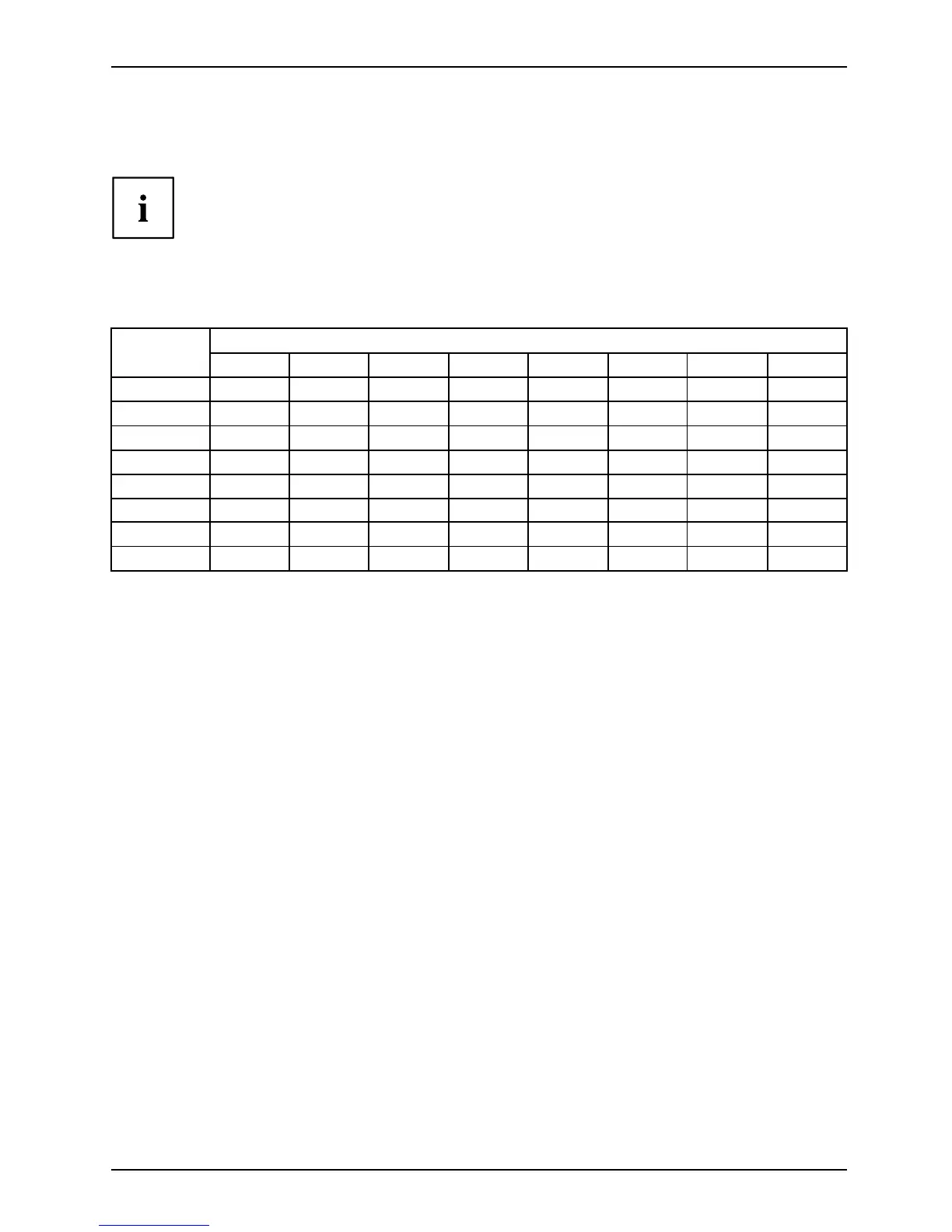
When using several colours for characters a nd background and giving the primary colours full
modulation, you can obtain very suitable c olour combinations (see the following table):
Characters
Background
black white purple blue
cyan green
yellow red
black
++
-
+++
-
white
+++
---
+
purple
++
-----
blue
-
+
-
+
-
+
-
cyan
+
--
+
---
green
+
--
+
---
yellow
+
-
++
--
+
red
-
+
----
+
+ Colour combination very suitable
- Colour combination not suitable because c olour hues are too close together, thin characters
are not identifia ble or rigorous focusing is demanded of the human eye.
A26361-K1240-Z120-7619, edition 1 27
 Loading...