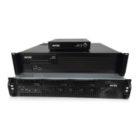
Appendix A: Panel Builder Tutorial
Project Pane Option Descriptions
On the right side of the main screen, you will find options that allow you to edit the current panel you are building, your overall
project, as well as view your project assets (such as available images, created scripts, and related modules). If you do not see this
pane displayed on the main page of the Project Editor, select Window > Project Pane.
This section shows the screens associated with these options as well as tables that contain details regarding each screen.
Item Properties Tab
Refer to Figure 41 and Ta ble 2 6 for detailed descriptions of the options available on the Item Properties tab. You must have an item
(button or widget) selected before clicking this tab in order to view the options.
FIG. 41
Item Properties Tab Pane
TABLE 26 Item Properties Pane Option Descriptions
Option Description
Basic View/edit the width, height, and location of the selected item (i.e., the selected button or widget).
Layer Choose what layer the selected item is on. Send the item Up or Down one layer, send to front (Top ), or
send to back (Bottom).
States Edit/add different states for the selected item (and the associated scripts and appearances during
each state).
Border Set the border width/color/etc. for the selected item.
Box, Drop, and Text
Shadow
Add/remove/adjust shadow settings for the selected item.
Touch Panel Key Use to assign a touch panel key number (if applicable).
Icon Choose an image to serve as an icon for the selected item.
Text Edit the text to be displayed on the selected item.
 To Next Page
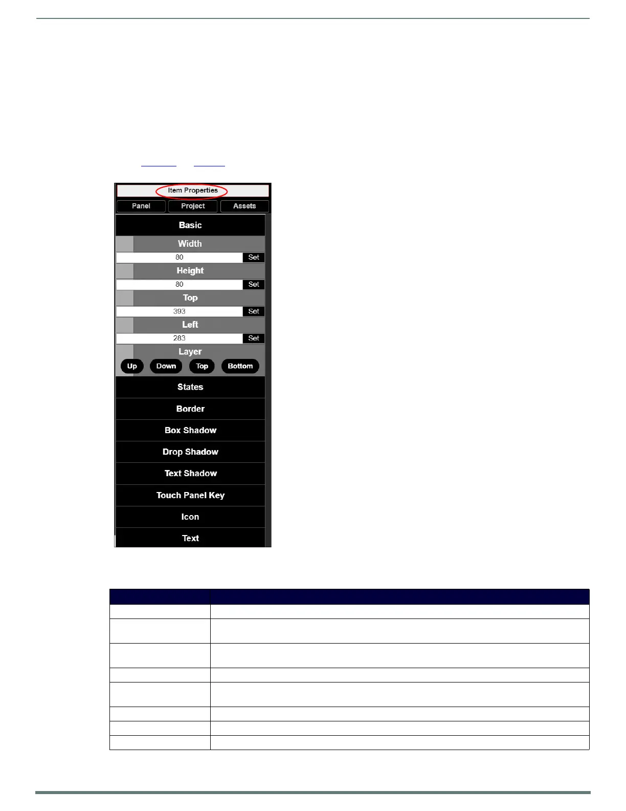 Loading...
 Need help?
 General