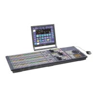
73
Button display status
The button display indicates the following according to
the status.
Groups
Buttons for related functions are grouped.
A line indicating the group name and range of the group
i
s displayed above the buttons.
Depending on the function, only one button or multiple
bu
ttons within the group may be selected.
Tabs
When the menu display area or a pop-up window
comprises several pages, each page is displayed on a tab.
Select a tab to change the display.
Selecting and Setting List Items
When the target of an operation is selectable from
multiple items, the items are displayed in a list.
List display
You can move the display position in a list using a swipe
operation or using the scrollbar slider in order to select a
target item.
The row for the item that has focus is shown in light blue.
When multiple items in a list can be selected, a checkbox
is d
isplayed on the left side of each item.
Selecting using a checkbox
To select an item, place a check mark in the checkbox.
Shortcut button
Jumps to the specified menu.
On/off switch
Turns a function on/off (enable/disable).
Radio button
Turns a function on/off (enable/disable).
Button
display
Status
When an on/off button is set to the on (enable)
po
sition:
A blue bar is displayed across the bottom.
When an on/off switch is set to the on (enable)
po
sition:
The switch is slid to the right (on state) and is
di
splayed in blue.
When adjusting a parameter:
The button is displayed in light blue.
When a radio button is selected:
The button is displayed in blue.
When a setting is not yet applied:
Depending on the function, the setting must be
a
pplied using the [Apply] button.
When a setting is not yet applied, a yellow
as
terisk (*) is displayed on the button.
When selection is disabled:
Buttons and switches that cannot be selected are
gr
ayed out.
Button Description
Select All checkbox
Scrollbar
Slider
Number selection button Operation
buttons
 To Next Page
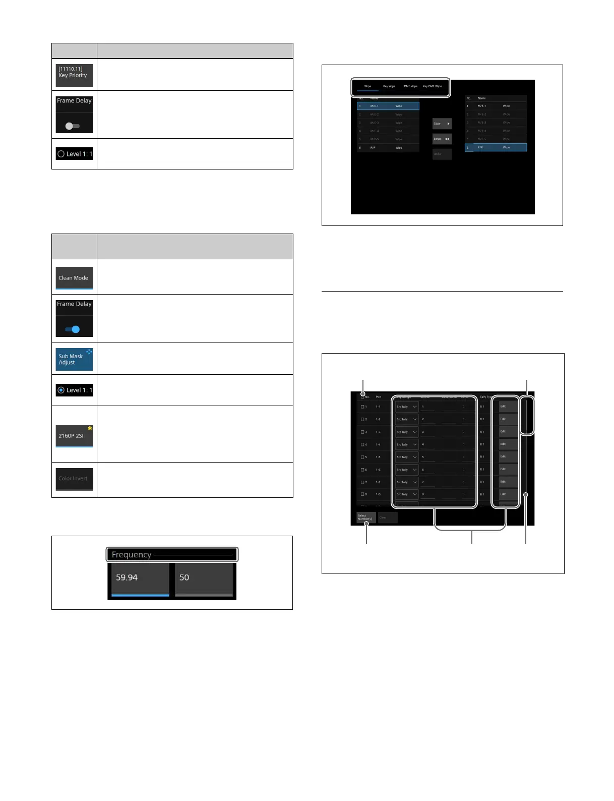 Loading...
 Need help?
 General