125
You may be wondering why the SYMB view is organized around histograms
H1, H2..H9 rather than simply around the columns C1, C2..C9. The
reason is that it allows you to easily cope with a frequency table by setting up
one column to represent values and another to represent the frequencies. If
not using a frequency table, the frequencies are normally set, by default, to 1
as can be seen on the previous page.
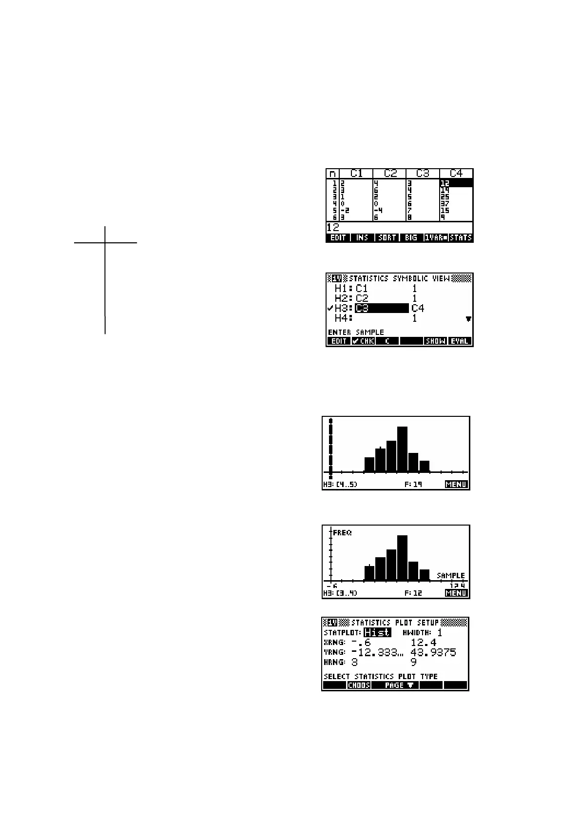
Working with frequency tables
Let's set up columns C3 and C4 to represent
the table below.
x
i
freq. Enter the values
3, 4, 5, 6, 7 and 8 into C3
3 12 and then 12, 19, 25, 37, 15 and 9 into C4
4 19
5 25 Now set up your SYMB
6 37 view to look like the one
7 15 right. Make sure
8 9 only H3 is checked.
The reason for the last instruction is that only one histogram can be drawn at
a time and if more than one data set is checked, only the first one is drawn.
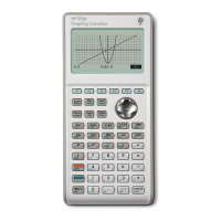
Auto scale
Now use VIEWS Auto Scale to plot the graph.
You will hopefully find that it looks like the one
on the right. The Auto Scale function is always
very effective in the Statistics aplet and is
recommended.
If you use the left/right arrows and look at the
bottom of the screen you’ll see that the
frequencies and ranges are listed. I found that
I could tidy this graph up a little by going into
PLOT SETUP and (on the second page) setting
the YTick value to be 5 instead of 1. I also
checked the Labels option. The result is shown right.
You probably noticed a lot of other options in
the first page of PLOT SETUP. Their
explanations follow.
 Loading...