86
‘Nice’ scales
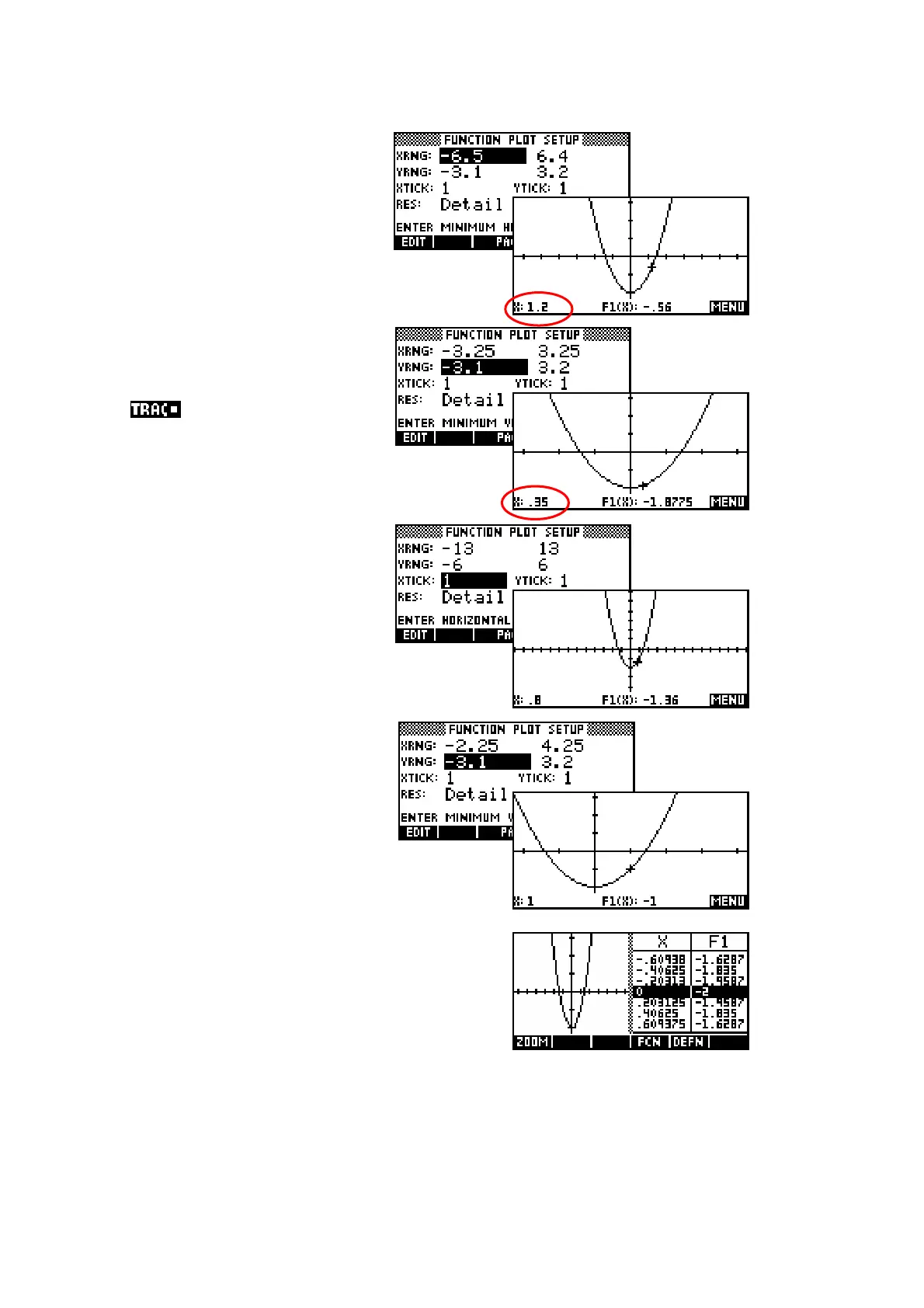
As discussed earlier, the reason
for the seemingly strange
default scale of -6.5 to 6.5 is to
ensure that each dot on the screen is exactly
0.1 apart.
There are other scales, basically
multiples of these numbers, that
also give nice values if you want
to along the graph. For
example, halving each of -6.5
and 6.5 will place the dots 0.05
apart.
To zoom out instead of in simply
double the values, producing
dots that are 0.2 apart.
Similarly, if you want to center
the graph around a particular
value then just add that value to
the range values. The example
right is centered around x = 1 by
adding 1 to -3.25 and 3.25.
A time when ‘nice’ scales are more important
is when you use the Plot-Table option in the
VIEWS menu. If you use the default axes you
will find that the dots, and hence the table
values are no longer ‘nice’ because of the 3
dots consumed by the line down the middle of
the screen.
 Loading...