Working With Properties
113
PDesign4 Touch Panel Design Software (v2.10 or higher)
General Properties
Once you have created a new button, you can use the General tab of the Properties Control window to
set/edit general (non-state oriented) button properties. The General tab contains a table that lists the
button properties for the selected button type.
To edit any of the listed button properties, click on an item in the right-hand column to activate the field.
Depending on the item selected, you can either set the item manually, select from a drop-down menu, or
both.
General Properties
Above Popups This option allows you the selected button(s) on a Main page to always remain on
top of any popup pages (default = No).
Note: This option is not available for buttons on a popup page.
Animate Time Down The timer intervals between states as the button animates from the On to the Off
state. This value is in 1/10th second increments (default = 2).
Multi-State buttons only.
Animate Time Up The time intervals between states as the button animates from the Off to the On
state. This value is in 1/10th second increments (default = 2).
Multi-State buttons only.
Auto-Repeat Select whether to apply auto-repeat to the button. Auto-repeat causes the button to
constantly cycle through its states (default = No).
Multi-State buttons only.
Border Style To change the Border Style for the selected button, click Border Style, and select
the desired border style from the drop-down list. If a Border Style is selected here,
then the Border Names (set at the state level, via the States tab) are limited to
those contained in the selected Border Style. If no Border Style is specified, then all
border names are available to choose from, at the state level.
Color Depth Select the color depth to be applied to the button (high-color (16-bit) or true color
(24-bit)). This setting should match that of the host PC.
Computer Control buttons only.
Column Display Order Enter a string of space-delimited integers to specify the order in which the columns
in the List Data Table are displayed in the List Box button, from left to right.
For example, using a List Data Table that contains 5 columns, you could enter
(without quotes) "3 4 5 2 1" to populate the List Box Button as follows:
• Column 1 on the List Box Button will display column 3 from the List Data Table.
• Column 2 on the List Box Button will display column 4 from the List Data Table.
• Column 3 on the List Box Button will display column 5 from the List Data Table.
• Column 4 on the List Box Button will display column 2 from the List Data Table.
• Column 5 on the List Box Button will display column 1 from the List Data Table.
List Box Container buttons only.
 To Next Page
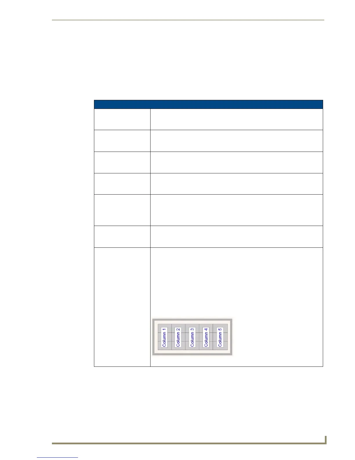 Loading...
 Need help?
 General
 Weight and Dimensions


