Chapter 5 _______________________________________________________ Plot-Assisted Setups
VAISALA______________________________________________________________________ 151
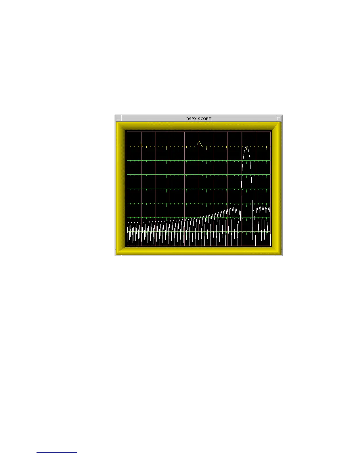
5.4.1 Interpreting the Burst Spectra Plots
An example of a plot from the Ps command is shown in Figure 27 on page
149. The display screen is divided into two independent areas. The major
portion (the lower seven eighths) is devoted to power spectrum plots of the
burst pulse and/or the matched filter response. The top portion (single line)
serves as a visual indicator of the present AFC level.
0916-041
Figure 27 Example of a Filter With Excellent DC Rejection
The horizontal axis of the spectrum plot represents frequency. The overall
span from the left edge to the right edge is half the acquisition system clock
frequency selected in the Mc menu.
The exact endpoints of the plot depend on which alias band the radar’s
intermediate frequency falls in. For example, with a 72 MHz acquisition
clock, a 30 MHz IF would imply a horizontal axis range of DC to 36 MHz,
whereas a 60 MHz IF would make the range 36 MHz to 72 MHz. The
frequency span is printed on the TTY when the command is first entered.
Since the left edge of the spectral plot always represents an integer multiple
of 36 MHz, either the left side or the right side will always be a multiple of
36 MHz. This is important to remember when designing the matched filter,
since fixed DC offsets in the A/D converters appear aliased at these
72 MHz multiples.
The vertical axis of the spectrum plot is logarithmic and is marked with
faint horizontal lines in 10 dB increments. An overall dynamic range of 70
 Loading...