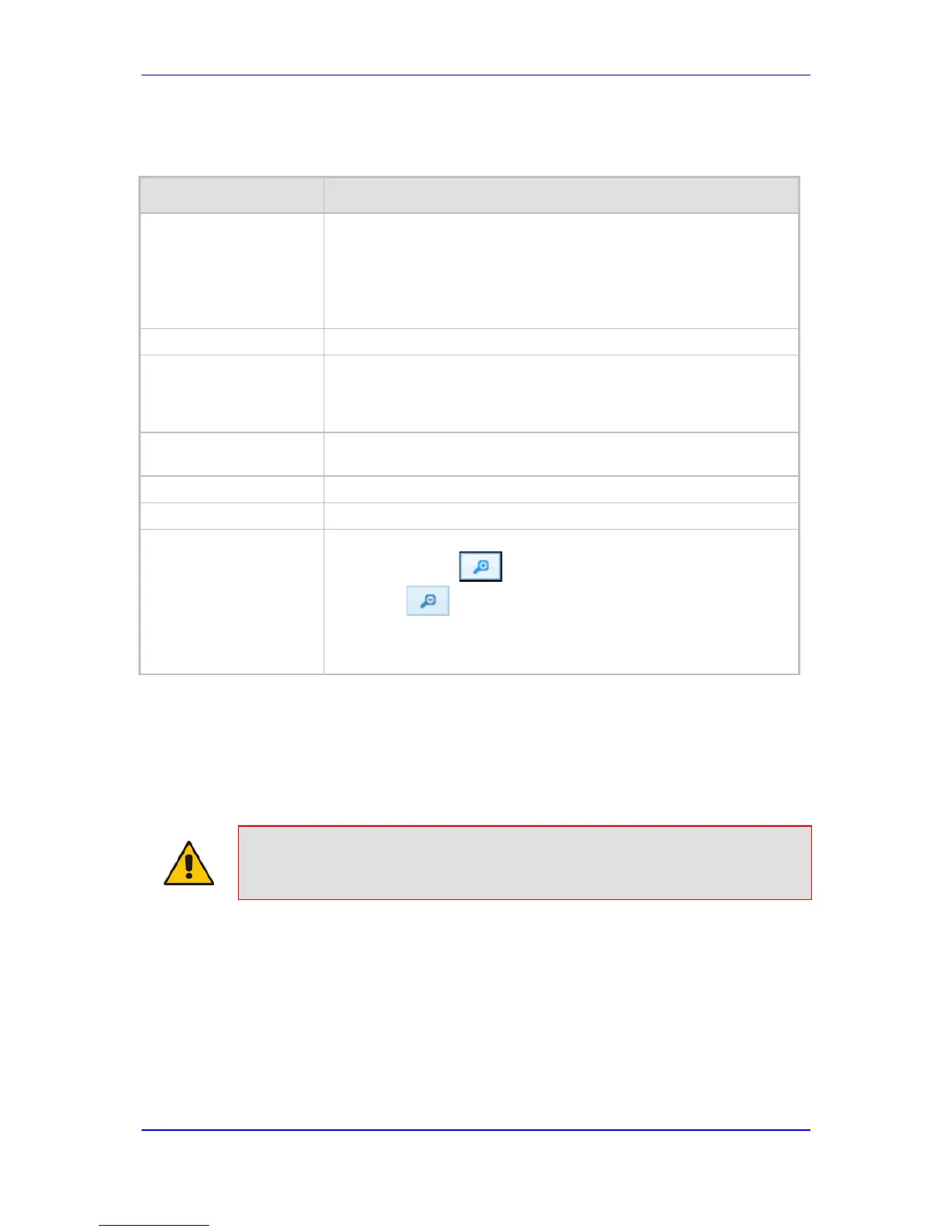
For more graph functionality, see the following table:
Additional Graph Functionality for Trunk Utilization
Button Description
Add button Displays additional trunks in the graph. Up to five trunks can be
displayed simultaneously in the graph. To view another trunk, click this
button and then from the new 'Trunk' drop-
trunk.
Each trunk is displayed in a different color, according to the legend
shown in the top-left corner of the graph.
Remove button Removes the selected trunk display from the graph.
Disable check box Hides or shows an already selected trunk. Select this check box to
temporarily hide the trunk display; clear this check box to show the
trunk. This is useful if you do not want to remove the trunk entirely
(using the Remove button).
Get Most Active button Displays only the trunk with the most active channels (i.e., trunk with
the most calls).
Pause button Pauses the display in the graph.
Play button Resumes the display in the graph.
Zoom slide ruler and
buttons
Increases or reduces the trunk utilization display resolution concerning
time. The Zoom In button increases the time resolution; the
Zoom Out button decreases it. Instead of using the buttons,
you can use the slide ruler. As you increase the resolution, more data
is displayed on the graph. The minimum resolution is about 30
seconds; the maximum resolution is about an hour.
56.3 Viewing Quality of Experience
The Quality Of Experience page provides statistical information on calls per SRD or IP
Group. The statistics can be further filtered to display incoming and/or outgoing call
direction, and type of SIP dialog (INVITE, SUBSCRIBE, or all).
Note: This page is available only if the SBC application has been enabled.
This page provides three pie charts:
 Loading...